Stop Feeling Dumb About Pairing Fonts
03/18/16
We’ve all been there: you’ve got a design direction and you’re ready to go, only to be sucked into hours of fruitless tinkering with different font combinations. And after all that, the result just looks like a missing cat poster. UGH.
You know you need to pick typefaces that will work well together, but it seems like there’s a lot more to it than meets the eye, and you don’t have a year to get up to speed on the ins and outs of typography.
Relax! You don’t need to know all the rules. A few simple guidelines and basic type knowledge will have you making great type choices in no time. In fact, you’re already the expert on the most important part!
Know the Objectives of Your Project Inside and Out
It’s hands-down the most important thing you need to know to pick type (or anything else for that matter). The tighter you have your objectives in focus, the easier it is to make design decisions, and the better your decisions will be. So when you’re picking type, keep those priorities in mind.
Part 1: Choosing Type
We’ve got our objectives hammered out: Now for some Type 101!
(Just a heads-up: this post is pretty long—and informative, so definitely bookmark this for later!—but if you don’t have time right now, just enter your email address below and I’ll send you the cheat sheet version.
The Basics
How do you know if a typeface will work for your project? First, you need to know your way around a letterform.
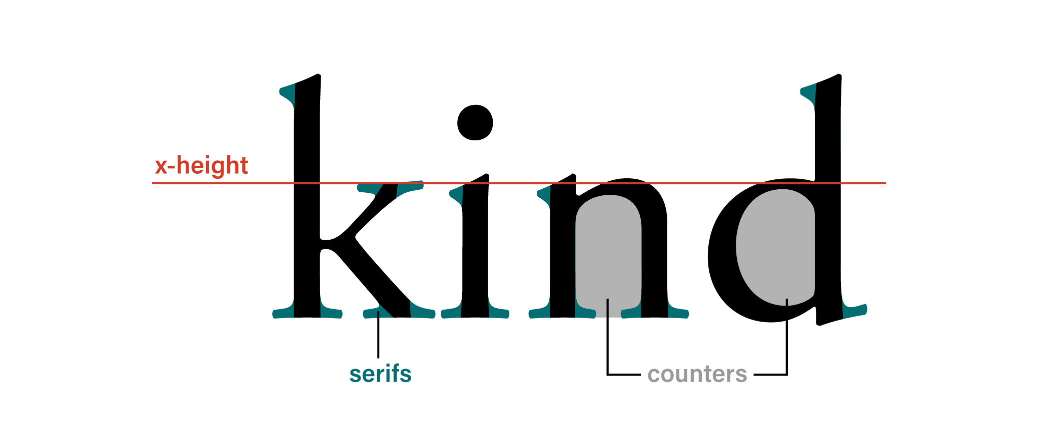
X-height: The height of most lowercase letters (such as the letter x) in the typeface. At small sizes, shorter x-heights are generally harder to read than taller x-heights.
Counters: The enclosed parts of letters like b, d, or p. Just like short x-heights, small counters can make reading hard at small sizes.
Serifs: You know these guys—the little strokes sticking off the ends of letters. Conventional wisdom says that serifs make type easier to read. However, research shows this isn’t really the case. Legibility is affected most by how quickly and easily the reader is able to recognize letter forms. So don’t sweat the serifs one way or the other!
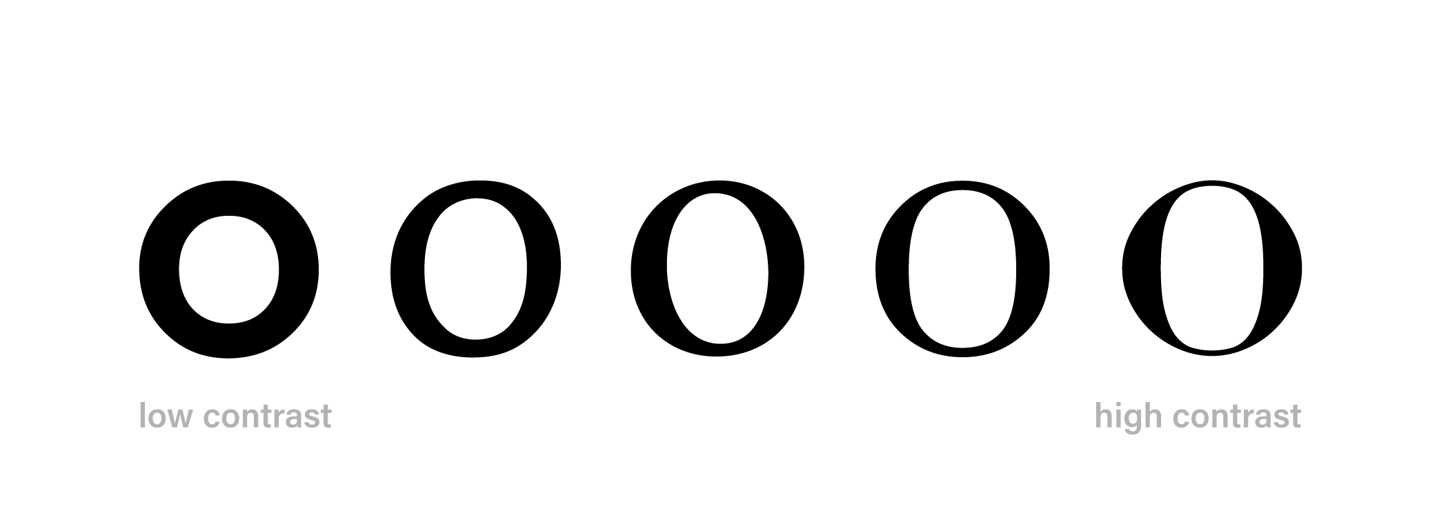
Contrast: The difference between the thickest and thinnest parts of a letter. High-contrast type is harder to read at small sizes. The thin parts seem to disappear, so letters are harder to make out. Even if you can see the fine lines, an effect called dazzling makes small, high-contrast type uncomfortable for reading. Avoid it at small sizes.
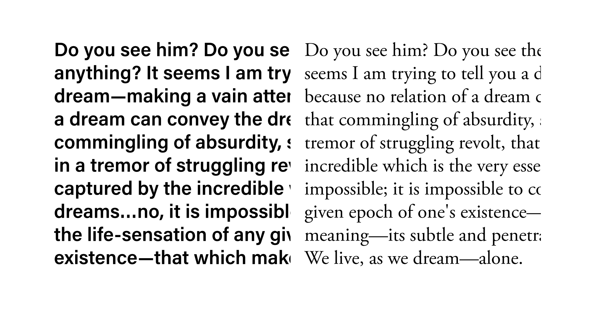
Color: When talking about type this actually has nothing to do with actual color, but with how dark or light a block of text looks from afar: if it’s too dark and dense it can be difficult to read. Don’t use bold weights for long blocks of text, and if necessary add more line spacing if your paragraphs look daunting to read.
Text Faces vs. Display Faces: Most type is designed with a specific context in mind. Type for small sizes, intended for longer reading, is called a text face and is designed to be legible and comfortable for reading at “text” sizes.
Display faces are for short text such as titles, signage, or headlines. They are designed to work best at larger sizes, and tend to be more expressive than text faces.
Often the description of the typeface will tell you what kind of a typeface you’re looking at: heed to those labels. If they aren’t labeled, use the features above to steer you in the right direction.
Quality Digital Type
So you found a typeface you really like for your project, but how do you know if it’s “good?” Again, this is largely determined by your needs.
Weights, Widths, Styles
For text faces, you want to make sure you have a “complete” typeface. These days that means a regular, italic, bold, and bold italic version. For display faces you may only need one style or weight, but think carefully about all the ways you will use it. Will you need a bold or italic? If so, you need a typeface that has those options. On the other end of the spectrum, many typefaces have so many weights and widths you don’t know what to do with all of them! The truth is you’ll probably never need all of them, though you may decide you prefer a certain weight over another—maybe the light looks better than regular for your body copy.
You really only need regular, bold, italic, and bold-italic. If a typeface lacks one of those, it’s probably not a practical choice, even if you like the look.
The Devilish Details
Quality typefaces have been designed with care. This is going to shine through in a number of different ways.
Languages: Well-designed typefaces have special characters for most (or all) of the languages that use the latin alphabet. So if your design will live online, it’s a good idea to have these characters. That way, as many users as possible will be seeing the type you’ve so carefully chosen.
Special Characters: You may not need additional characters such as an ampersand, small caps, or old-style numerals. But you might. These kinds of details can add a level of polish to your typography. Less frequently used on the web but still worth considering are ligatures, particularly with more traditional-style serifed typefaces. If this is something you know you’ll want to use (maybe in your display face?), then check that you have those glyphs.
Proper Punctuation: Carefully-designed typefaces include a complete arsenal of glyphs for properly type-setting punctuation, such as true quotation marks (“curly quotes”) and inch marks. Not sure if you’re using the right marks? Here’s a good guide.
Kerning and Spacing: Same idea here: a well-designed typeface will be thoughtfully and carefully letter-spaced and kerned. So test out your typeface and make sure it’s up to snuff.
Quality Letterforms: Admittedly, it can be tricky to explain what makes a letterform poorly-drawn. But trust your gut—you’ve seen a lot of type in your life, not just as a designer, but also as a reader. You have an instinct about letterforms and you should trust it. When you test out the typeface, notice your reaction. Do the letterforms seem awkward-looking? If the answer is yes, particularly with a cheap or free font, steer clear. Quality typefaces tend to have a sense of balance and unity that, even if you don’t know much about type design, you can feel just by looking. Repeated elements (the curve of n, h, m) should look consistent, letters should have a similar amount of contrast and weight of stroke, the tops of B and R shouldn’t feel like they’re about to topple over. If a typeface “feels” wrong to you, it’s probably poorly drawn. Trust your gut and find something better.
Free Fonts
There are a lot of great free fonts out there, but it’s important to know what you’re getting so you can make an informed decision. Free fonts fall into a few categories.
Sample Fonts: Excellent quality fonts in only one or two weights. I love Sanchez Slab and have the full family on my system. It’s a high-quality font and follows all the rules outlined above. But having only one weight on google fonts? Not particularly useful. Always start with your project’s requirements and base your decisions on those.
Open-Source Fonts: I love these! The main drawback with these (true of any free font) is the lack of exclusivity. Anyone can use them, so there’s the potential that they may be over-used. But from a functional perspective, they tend to be well-designed and offer a lot of options for typesetting.
Fan and Novelty Fonts: These are probably the easiest to avoid. They tend to be the most poorly drawn and lack most necessary characters. Fans of TV shows and video games, type hobbyists, and other ameteur type designers create fonts based on logos they love, their handwriting and other “wouldn’t it be cool if…?” inspirations. These are not suitable for most design applications.
Research Pays Off
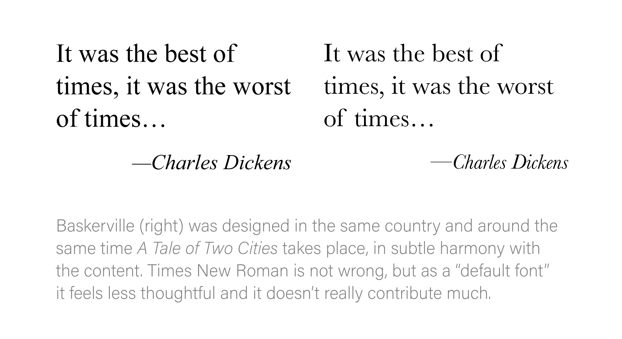
Even with these guidelines for picking type, the most important thing to keep in mind is the needs of your project. Spending some time up front doing research will help your type design sparkle. Consider what you’re trying to communicate and how your type can help you. Type from a certain time period, designed for a certain industry or medium, or to use in a particular context can go far in subtly highlighting ideas you’re trying to express.
As a bonus, research helps you clarify your thinking. When you share your work with your client, you’ll be able to explain specifically why you made the choices you did. They’ll appreciate your work all the more.
Choosing Type, in Summary
- 1) Know the objectives of your project and internalize them.
- 2) Pick the right kind of type for the job.
- 3) Make sure the typeface is sufficiently complete for your needs.
- 4) Look for well-drawn characters and good kerning and spacing.
- 5) Do a little research.
Part 2: Pairing Type
It’s really not as magical and mysterious as people make it out to be. Now that you know a bit about typefaces, you can just apply the simple principle of unity and variety and you’ll be a type-pairing machine in no time.
But where to start?
Start with the Text Face
Why? Because there’s more of it. It will have a bigger visual impact on your design, so make sure it’s spot-on. Just as importantly, the reader will spend much more time reading this typeface: pick something highly legible that can be read comfortably in long blocks. Choosing type is like picking a voice for your content. Your text face needs to be a newscaster: it’s essential that your type “speak” clearly so it can be understood by everyone.
Your display face can have a bit more character, but don’t go for anything overly difficult to read. The main job of type is to be read.
Unity and Variety
There’s this concept in art of unity and variety—the idea is that all compositions need both. If a composition is only unified, the viewer may lose interest. If there’s too much variety, there’s nothing holding the composition together: it’s chaos.
This applies to pairing type as well. When you are combining two typefaces, it is essential that there is some contrast between them (variety), as well as some elements in common (unity).
Depending on the needs of your design, there are a few different approaches you can take:
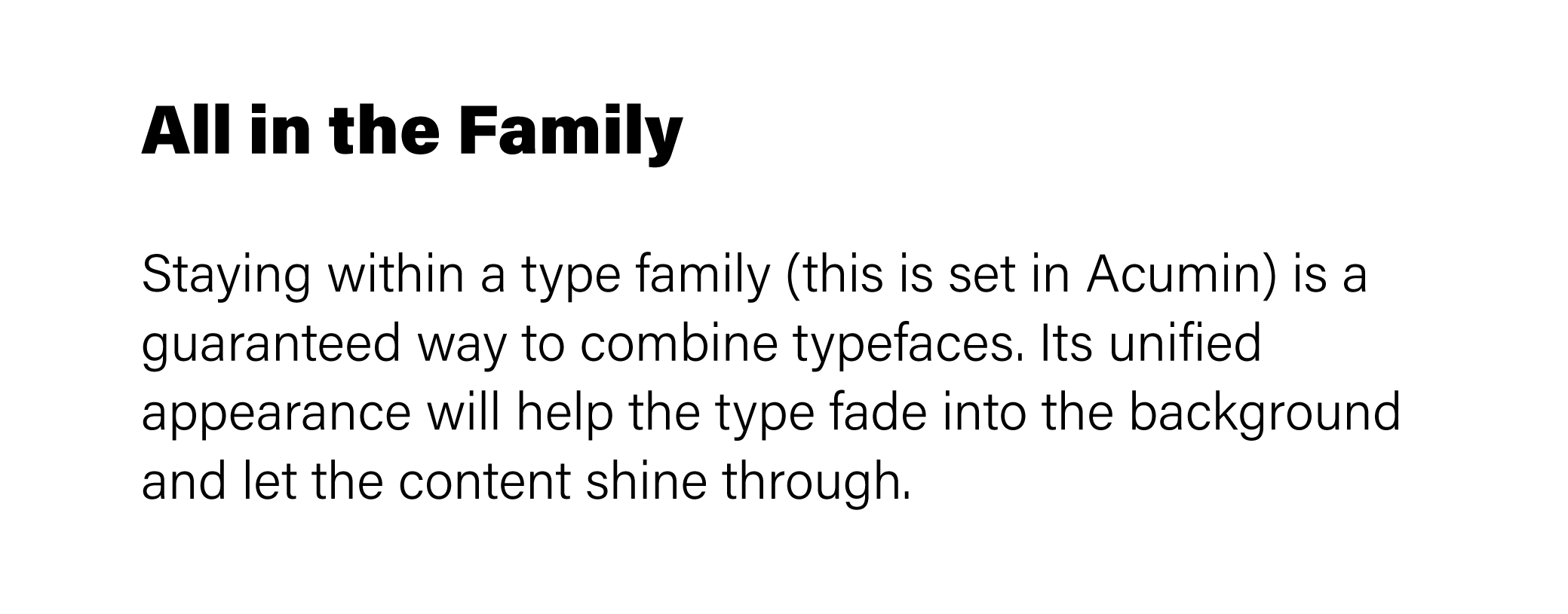
Font Family. This is a safe approach that works because the type is designed to work together. It can look a bit conservative because there’s not a lot of contrast, but it’s a sure-fire way to make sure your type pairing works.
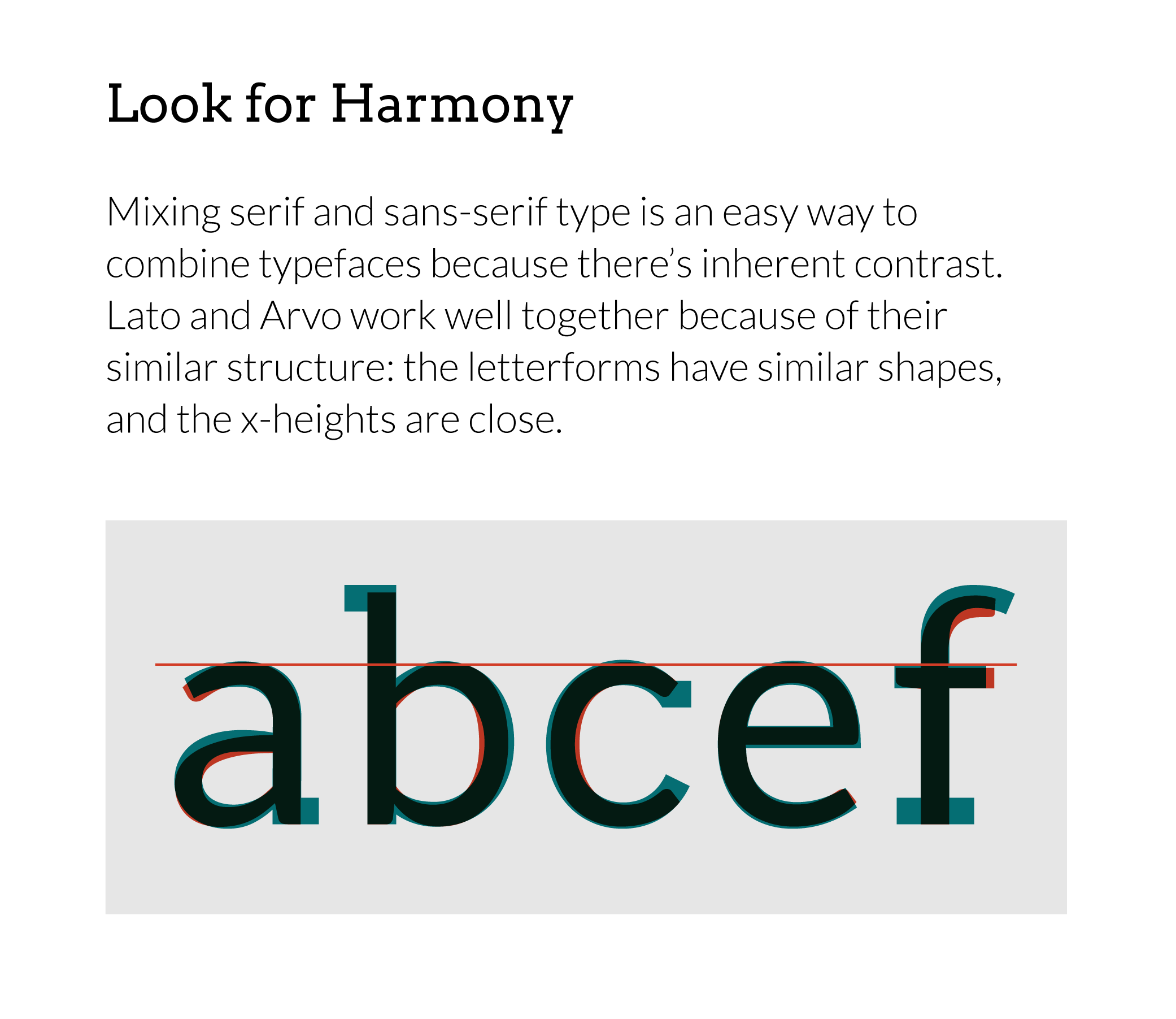
Serif with Sans-serif. This is great approach because there’s already an element of variety (serif vs. sans). Pick one as a display face, the other as the body. Since you’re starting with a lot of contrast, look for ways to unify the two faces. Study the forms of the typefaces side by side: do they have a similar character width? A similar x-height? Are the round letters more geometric (perfectly round) or not? If the two faces don’t have some kind of structural commonality, they probably won’t work great together.
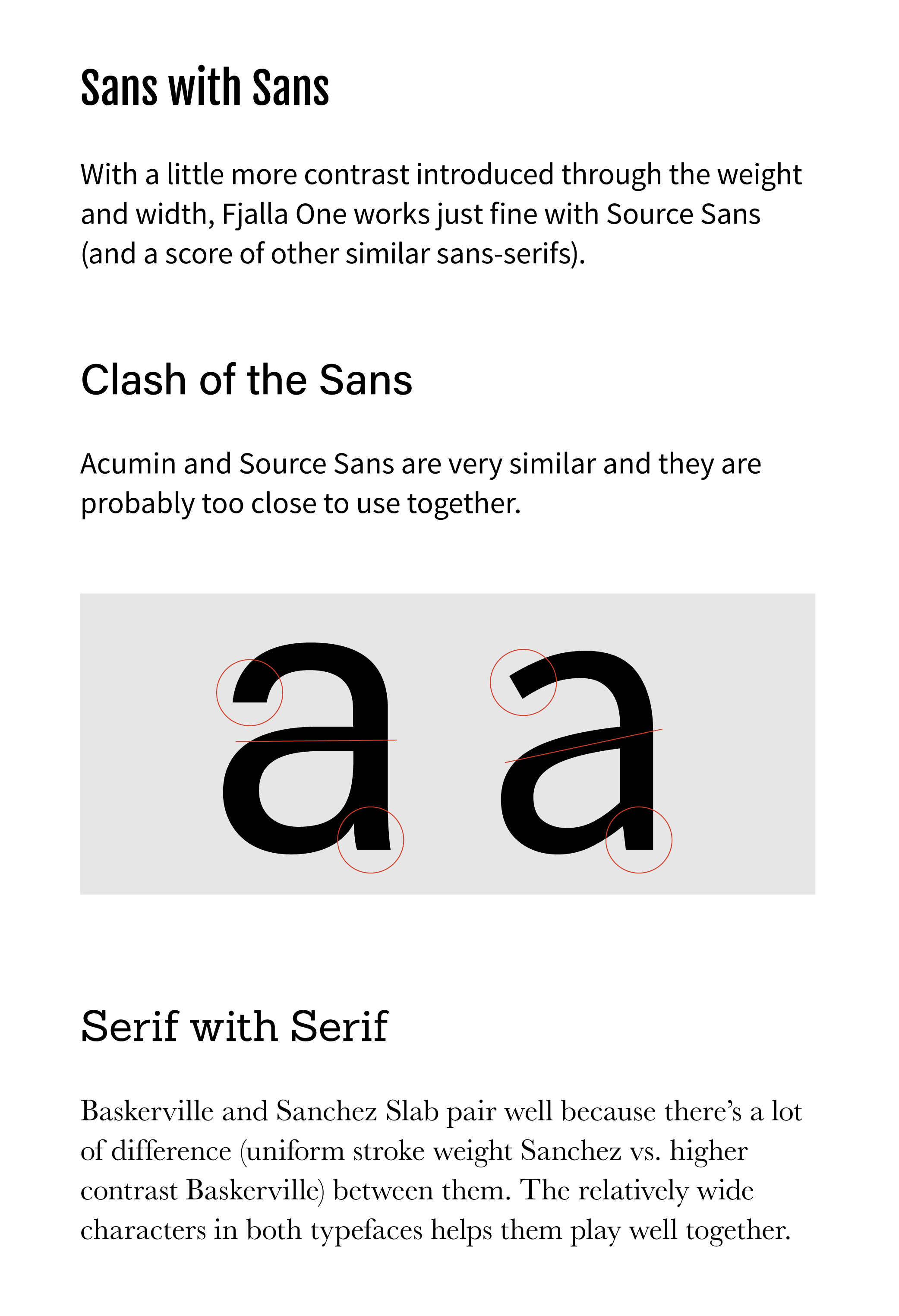
Like with Like. It can be tricky to pair faces that share a classification (e.g. serif with serif). Just like the black shirt you washed one too many times doesn’t quite match your black pants, they’re close, but something is definitely off. But thinking in terms of unity and variety, you can still make great pairings. With this approach you start with a lot of unity, so seek out variety. One way is to find faces that have very different levels of contrast (the difference between thick and thin strokes). Other ways to create variety are through weight, width, and style: examine the type at a large size side by side to see what the letterforms offer for a good mix of unity and variety.
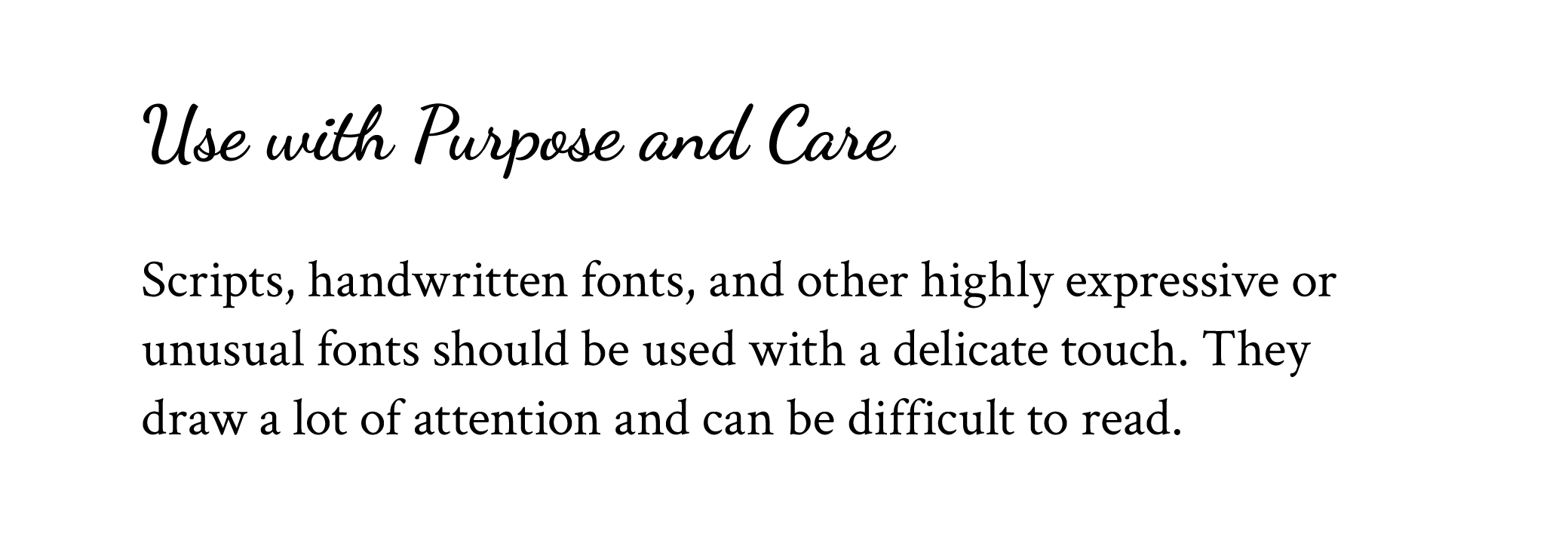
Script and Handwriting Fonts. I don’t advise using a script or handwriting font for body text, but when used thoughtfully, these can work as a display face with either a serif or sans-serif text face. You are starting with a lot of inherent contrast, so examine the structures of the letters to find some similarities. The letterforms themselves might not have a lot in common, but think about what each is communicating through its style (formal/informal, modern, traditional, etc) to bring harmony to the pairing.
If you have two fonts that work together but still seem a little too similar, try changing the size or weight to add some variety.
Need more unity? The easiest place to start is to look at the shapes of the letterforms. Or try something more subtle and sophisticated: unify your typography by finding type designed around the same time, or to find type inspired by the same tool or medium (broad-nib pen, carved in stone, etc—you can usually figure this out with just a bit of googling).
Pairing type doesn’t need to be mysterious or scary! Start with quality typefaces, think unity and variety, and pair away!
Remember that you are the expert on the most important aspect of choosing and pairing type: the requirements of your project. The more you internalize your objectives, the better your choices will be.
If you liked this article, don’t miss my cheat sheet for pairing Google Fonts! Type your email below to get the cheat sheet and more goodies just like it delivered straight to your inbox.
All the example typefaces in this post are available either through Typekit or Google Fonts. Typefaces used: Acumin Black, Acumin Light, Acumin Regular, Arvo, Baskerville, Dancing Script, Crimson Text, Fjalla One, Lato, Sanchez Slab, Source Sans Regular. My blog is set in Pragmatica Web and Clarendon URW.