What the New Google Fonts Gets Right—and Wrong
06/20/16
Over the years, Google has steadily been improving Google Fonts, adding more fonts of increasingly high quality—faces like Work Sans, Libre Franklin, and a host of fresh display faces are a far cry from the dated and dowdy fonts available early on. Now they’ve undertaken a complete overhaul of the website to match the caliber of their newer typeface offerings.
This redesign in many ways feels really well thought out: Google is clearly trying to raise the bar for Fonts, not just slapping a shiny coating on it. All the changes point to a level of seriousness and commitment to quality—both in the user experience and the fonts themselves—that informs the choices they’ve made.
Usability
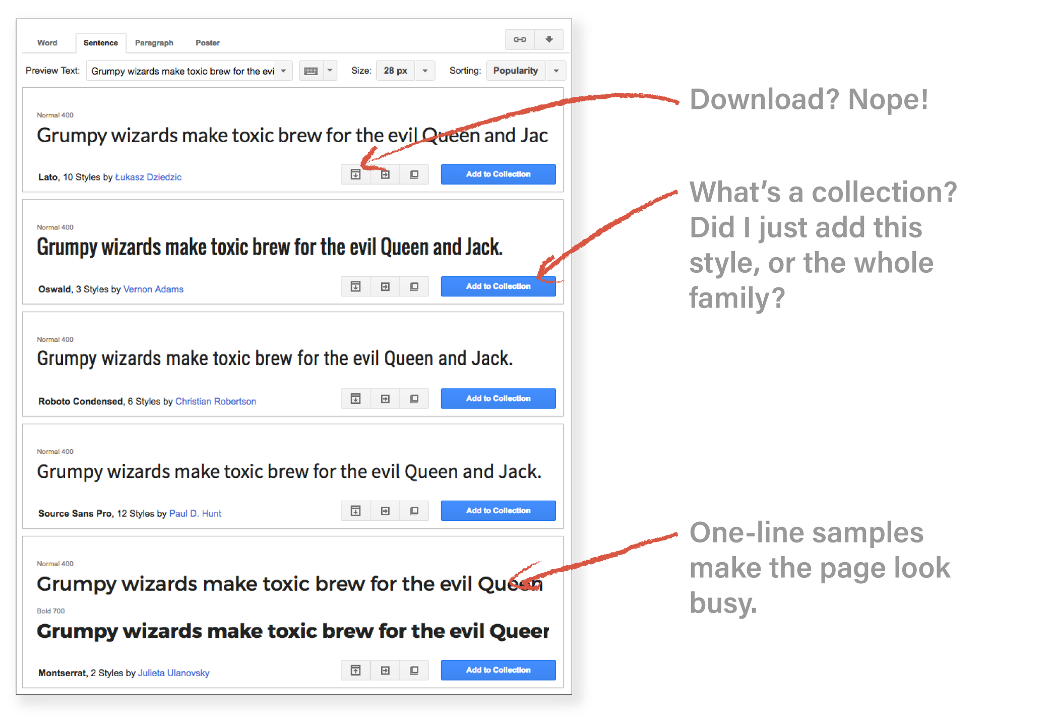
It’s obvious how much thought went into the process of font selection (though not of finding fonts!—more on that later), a consideration which was completely absent from the old Google Fonts. It’s much easier to get a sense of the look and feel of the font from the sample “tag,” and it’s easier to differentiate the typefaces in this layout as well. Previously, no matter what view you chose, the page felt busy. The new layout is much easier to make sense of.
Another improvement in usability: when you pick fonts it’s easy to tell what’s happening, and what actions you can take (did you ever click the “expand styles” icon thinking it was a download icon in the old version?). The only element of color (without hovering) is the selection icon. And no more “collections.” The load time indicator is also a nice touch.
Elevating Typography
My favorite improvement is the the amount of information given about each font. The “about” section for each typeface provides users with context like historical inspirations or the particular medium or function the type was designed for. That kind of information is incredibly useful when trying to choose the right type for the job.
Kudos also for the type designer bios. This is another touch that highlights quality and the craft of type design, which is further underscored by the “about” section, more polished font tags, and the “featured” section. Not to mention, Google Fonts continues to expand its offerings with legitimately excellent typefaces.
Google Fonts is sometimes viewed with disdain among certain design professionals (though just as many are big fans for a variety of reasons) because it is seen as undercutting the value of type design. My feeling on this? There will always be a role for free fonts to play, and there will always be a need for highly skilled type designers who deserve to be paid for their craft. And by upping their game, Google Fonts is educating their users about the value these designers bring. I would guess that a sizable portion of free font users have never paid for a typeface—a more discerning user of type will come to see the value of great type, and then perhaps the value of purchasing type.
Other Nice Things
A lot of the other changes seem nice but not life-changing. The color themes are cool, but I don’t know how useful they are. It’s handy to be able to quickly see how something looks reversed onto black, but if you want to try particular colors it makes more sense to try it in TypeCast (another nice but non-essential feature, seeing as you could just download a font to try it out). The collapsible search is also a nice touch but not a biggie in my opinion. I also like the slider bars for different type features such as width, but every now and then you end up with miscategorized faces. The interactive preview brings Google Fonts up to par with other major font marketplaces.
At this point the “Featured” page is not super-useful, but I imagine they’ll be adding more and doing more with it. It’s indicative of the redesign’s philosophy of highlighting quality and craft, and the aspiration of becoming a more serious type resource.
One change that had me scratching my head: the “usage by country” pie charts. There are plenty of usage metrics that translate into useful features (sorting by trending fonts is an example) but why would anyone need to know which country uses a font the most? This isn’t even a comparison between fonts (which might also be useful). There’s probably something I’m missing here, but whatever it is, I doubt it needs to be featured so prominently.
Font Classification
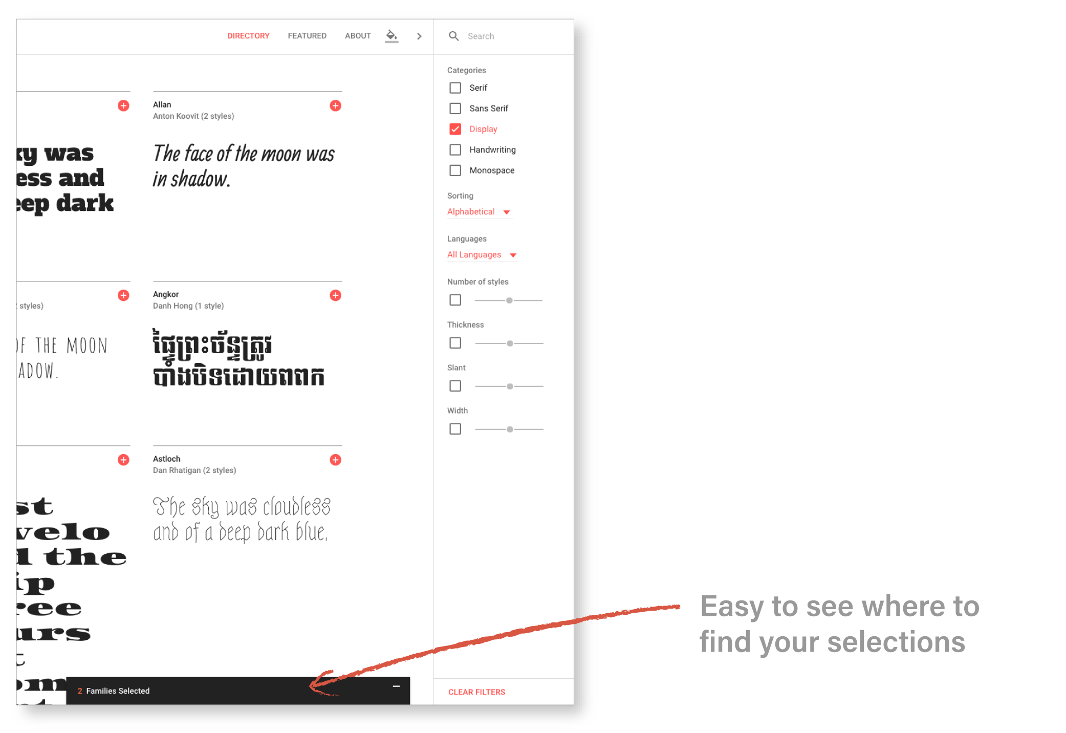
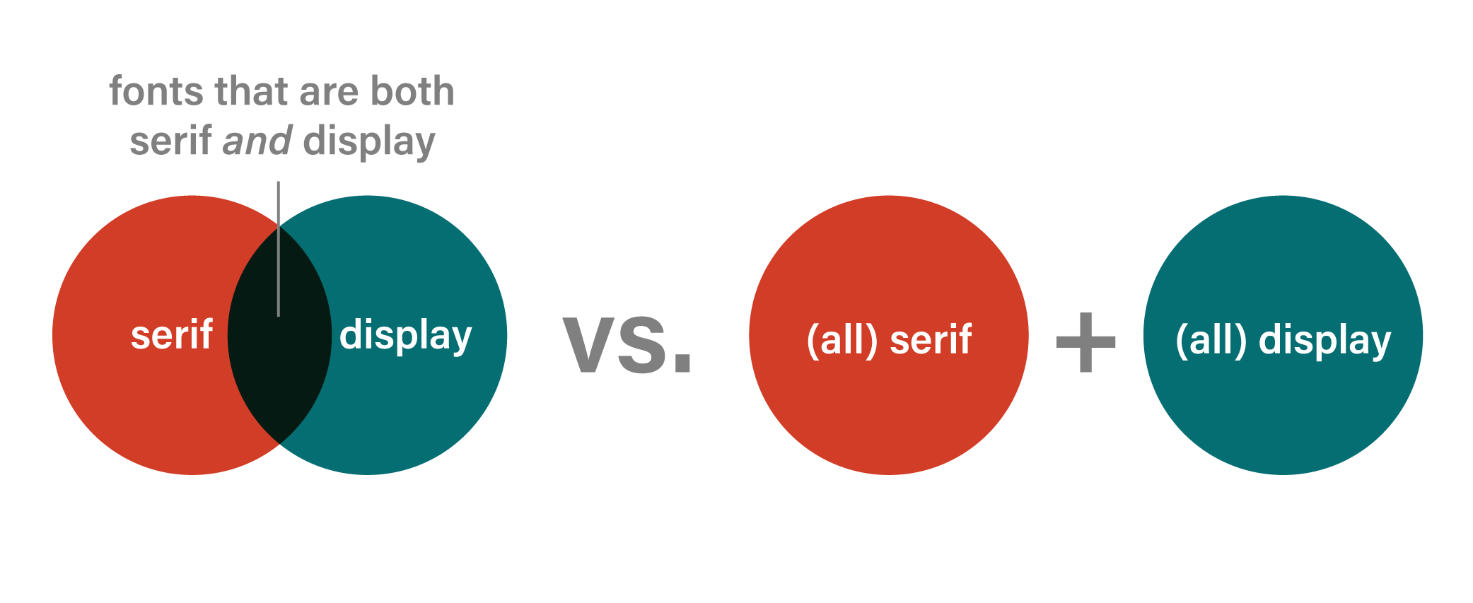
I know there are myriad ways to classify fonts, but with all the other attention to detail on the redesign, I wish this had gotten a little more love. I have always found Google Fonts’ search categories counterintuitive, and I’m surprised they kept them the same. Each of the categories is basically a list of fonts. When you select multiple categories, you get more results, not fewer. It’s the opposite of both expectation and function (you’re trying to narrow down your choices to pick a font). If I search a clothing site for dresses, in black, in a size 2, each of those criteria narrows my search. Why doesn’t the same thing happen when I want, say, a serif display face? Instead I get all the serif typefaces, plus all the display faces.
Another way classification could have been improved would be to expand the number of categories. People may not agree on the nitpicky details of font classification, but wouldn’t it be handy to be able to search for slab serifs, or maybe add a script category separate from handwriting?
I will say to Google’s credit, where they have only one style of a typeface, they list it as a display face (even if the complete family would be a text face), so you don’t get over-excited about a particular font only to realize there are no bold or italic styles.
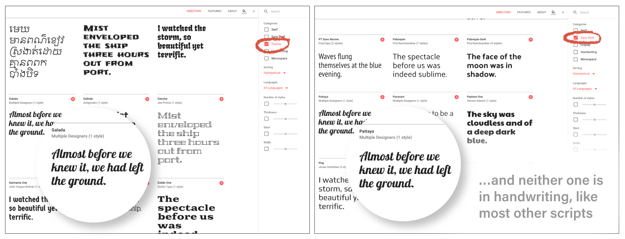
However, a few fonts are just plain misclassified. I found a script in the sans serif list, a literally identical script (to my eye at least) listed as a display face, and neither of them listed as a handwriting font, where the majority of scripts were located. (Of course, that’s a result of the current organization system forcing you to choose between display or handwriting rather than tagging a typeface as both, which underscores the importance of overlapping classification rather than separate lists.) Methodical organization should be high on the priority list for a type website: If I can’t find it, I can’t use it.
Overall, there’s a lot to love about the Google Fonts redesign. But cleaning up the classification system was definitely a missed opportunity.
If you found this article interesting you’ll want to subscribe to my newsletter for more typography information and resources. Enter your email below to recieve my cheat sheet for combining fonts!