
Know whether you're looking for a text face (small type for body copy) or a display face (larger type to grab attention).
There are no rules! (Well, make sure it's readable.)
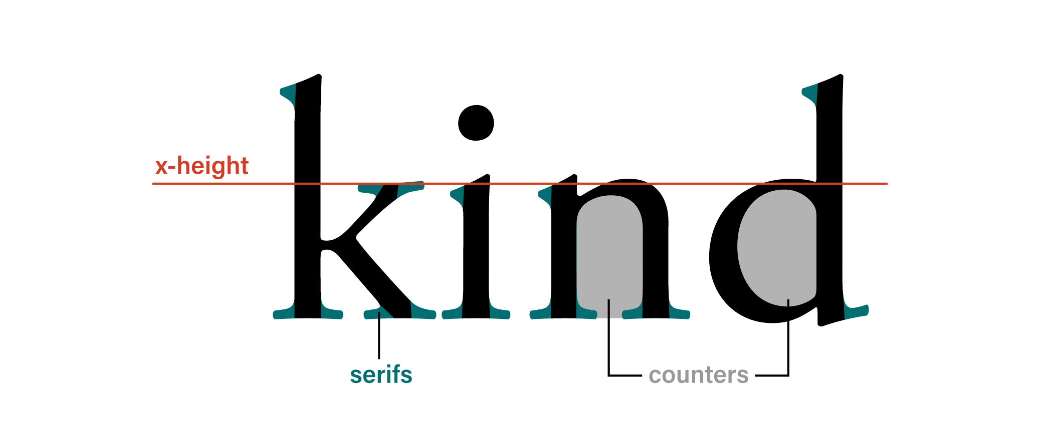
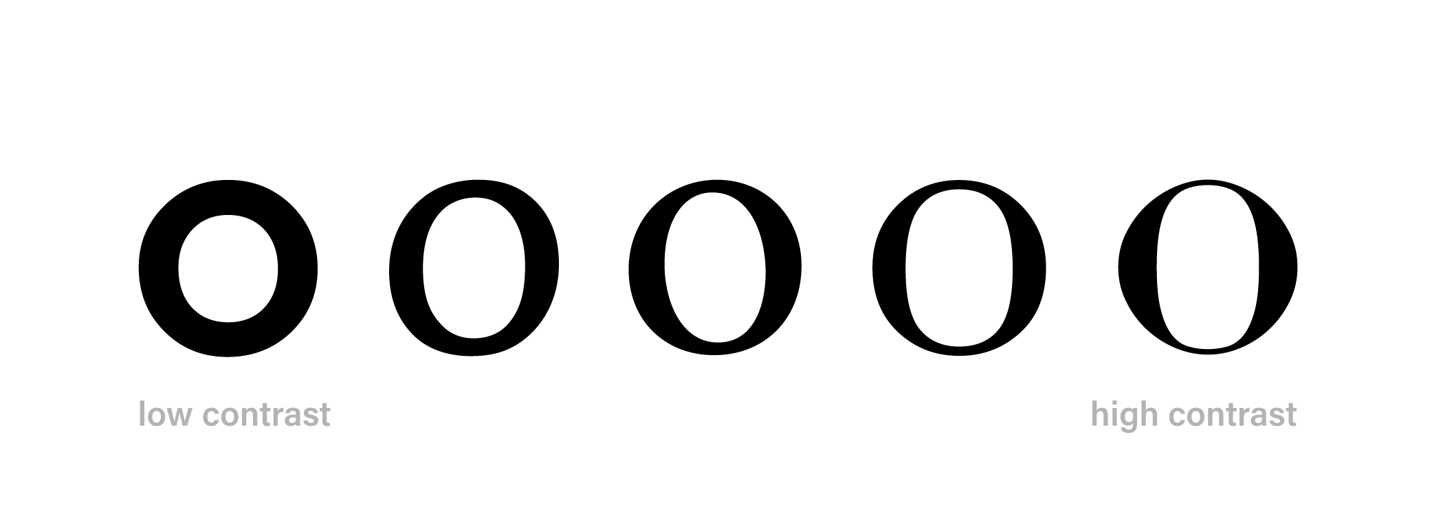
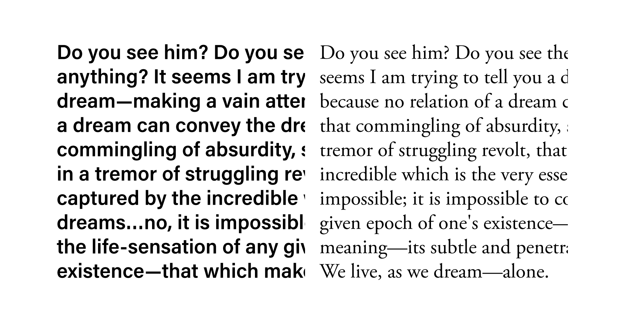
Start with the Text Face—there's more of it so your design is more affected by that choice. Plus, falling in love with a particular display face can (in my opinion) sometimes box you in.
Think Unity and Variety when you pair type: not too similar, not too much contrast between the faces.
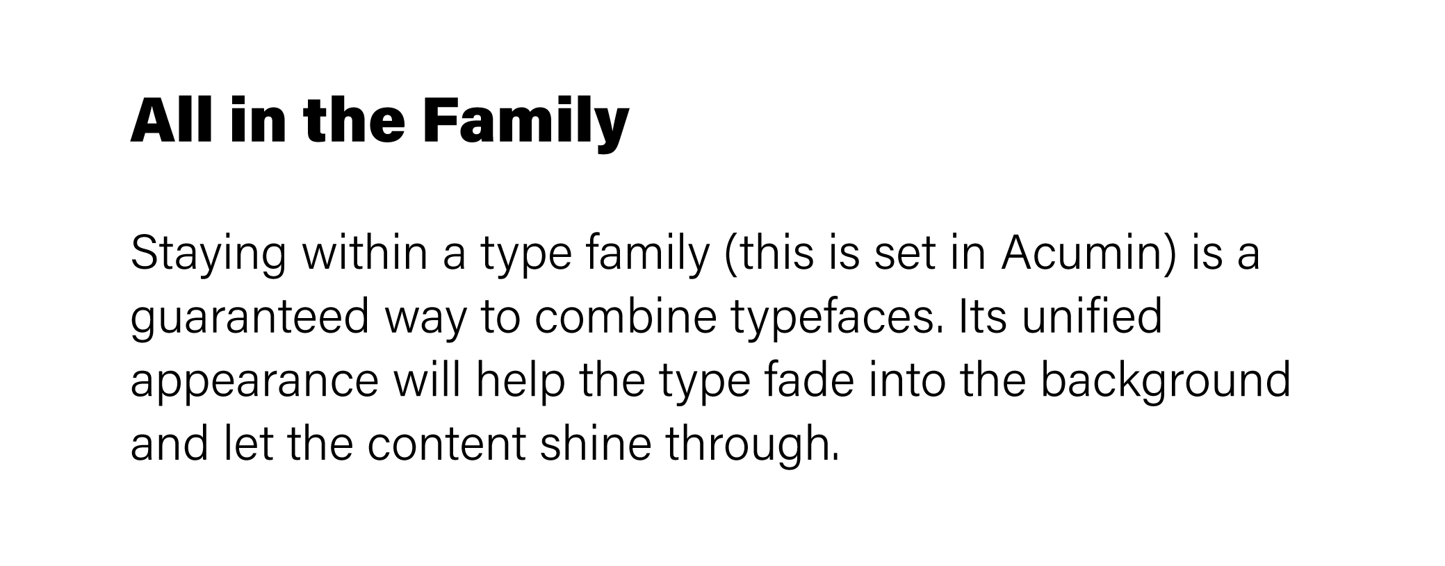
Stay in the same type family.
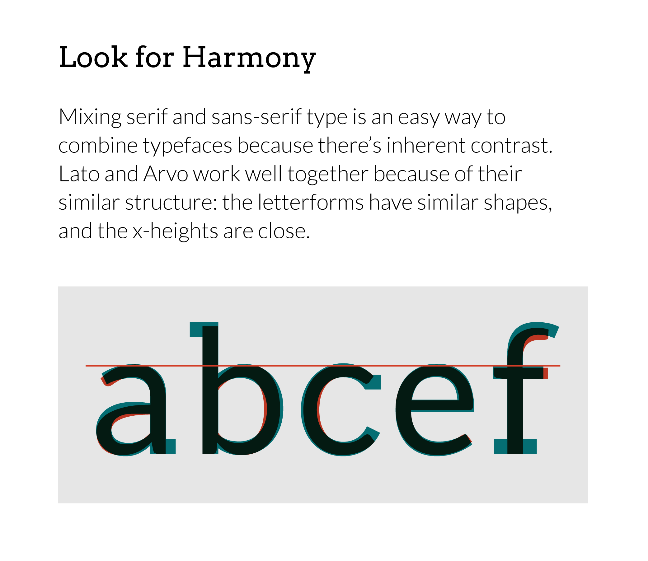
Tried and true: pair a serif with a sans-serif.
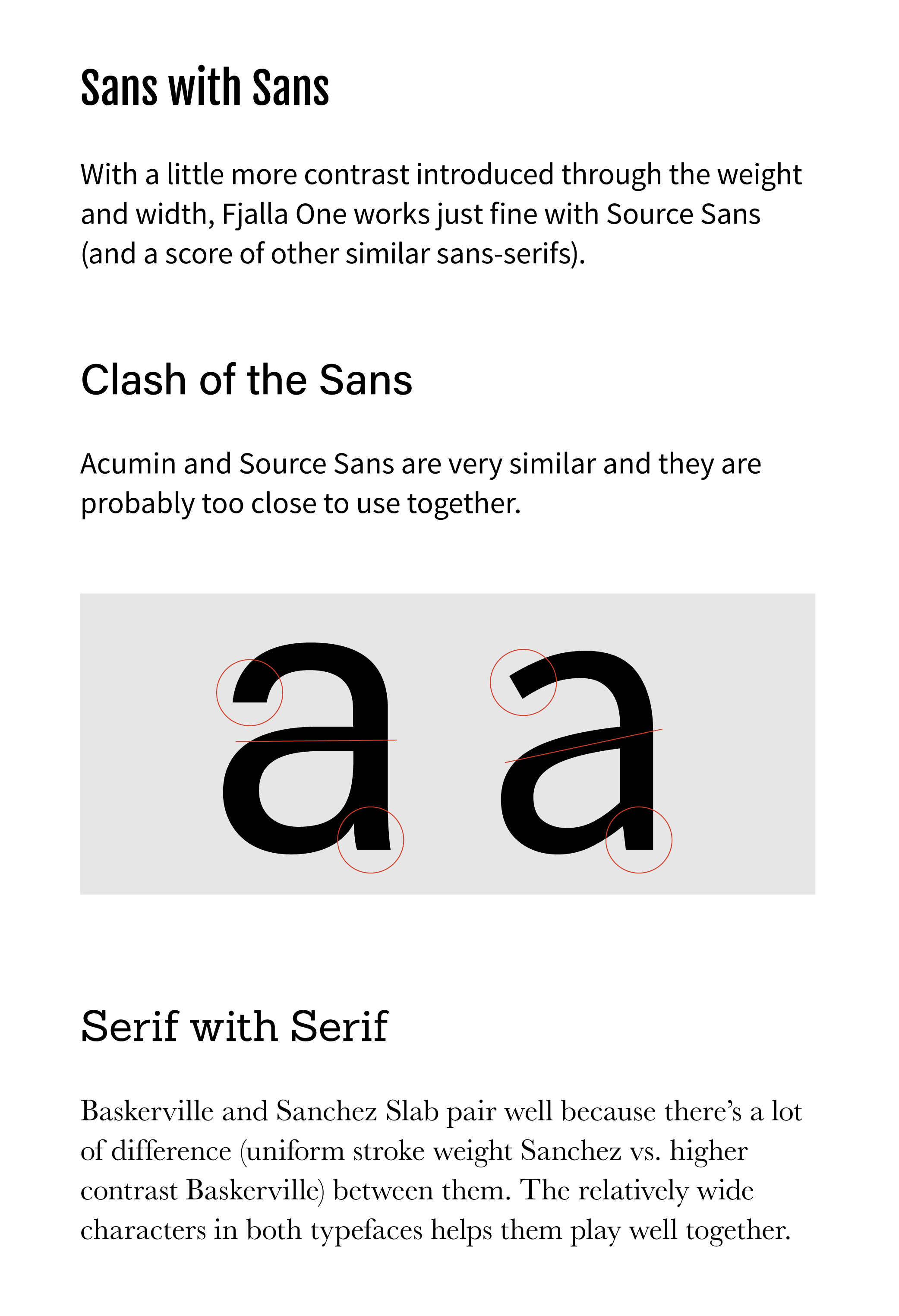
Pair two typefaces with the same classification.
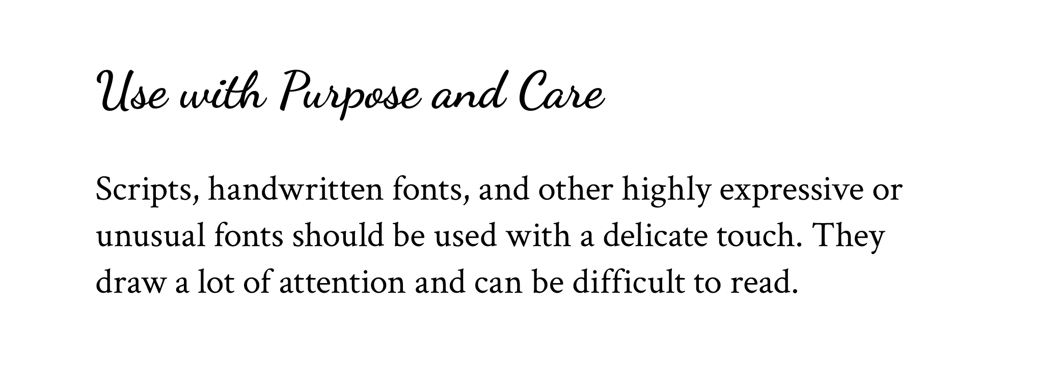
Use a script or handwriting font: I wouldn't recommend using these for the text face, but they can work great as a display face.
Remember, you know best what the objectives of your project are. When in doubt, ground your decisions in what you want to achieve.
This is a shorter version of a more in-depth article on combining type—you may want to read that if you're looking for a little more information.
If you found this helpful, sign up below to get a google fonts cheat sheet I'm working on, plus many more typography resources!