Just Say NOva—13 Proxima Nova Alternatives
05/09/16
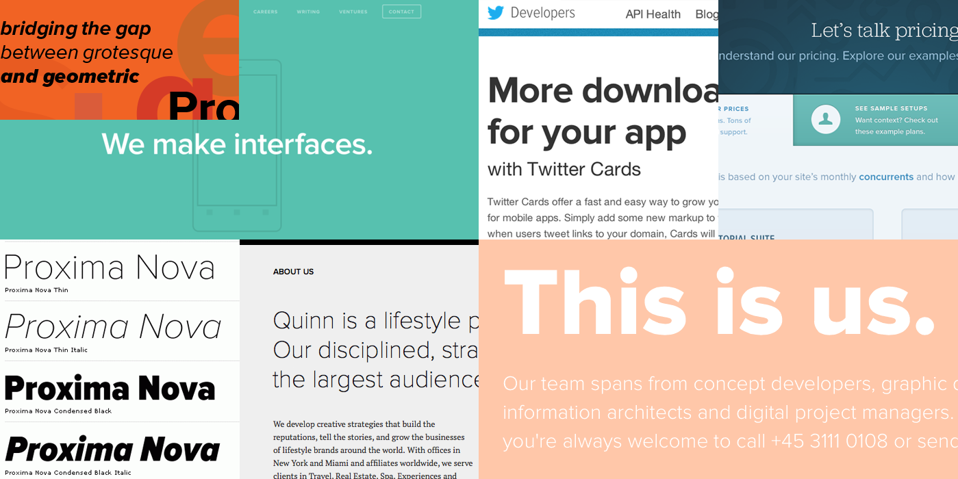
It’s no secret: web designers love Proxima Nova. And with good reason: It’s a great go-to. A beautiful, clean sans-serif that’s geometric but not, you know, too geometric. But as one of the most prevalent typefaces on the web several years running, it’s starting to feel like we’re stuck in a rut.
Break away from the pack with a fresh font choice! These 13 typefaces are really clean and geometric like Proxima Nova, but they’ll also lend a unique voice to your next project.
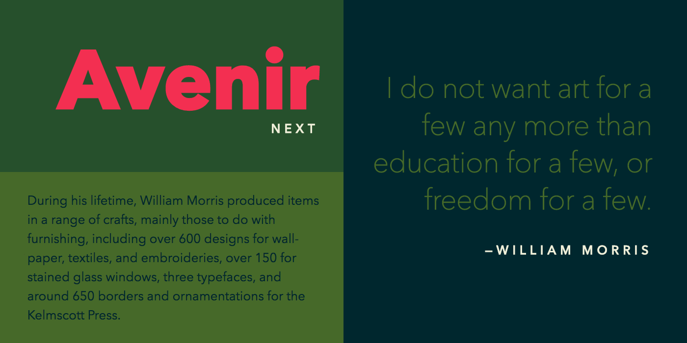
Avenir Next
Avenir was designed by Adrian Frutiger in 1988 and he considered it his greatest work. He worked with Linotype in 2003 to develop a version with a larger font family that was also better suited for the screen. Avenir Next was the result. Definitely a modern classic.
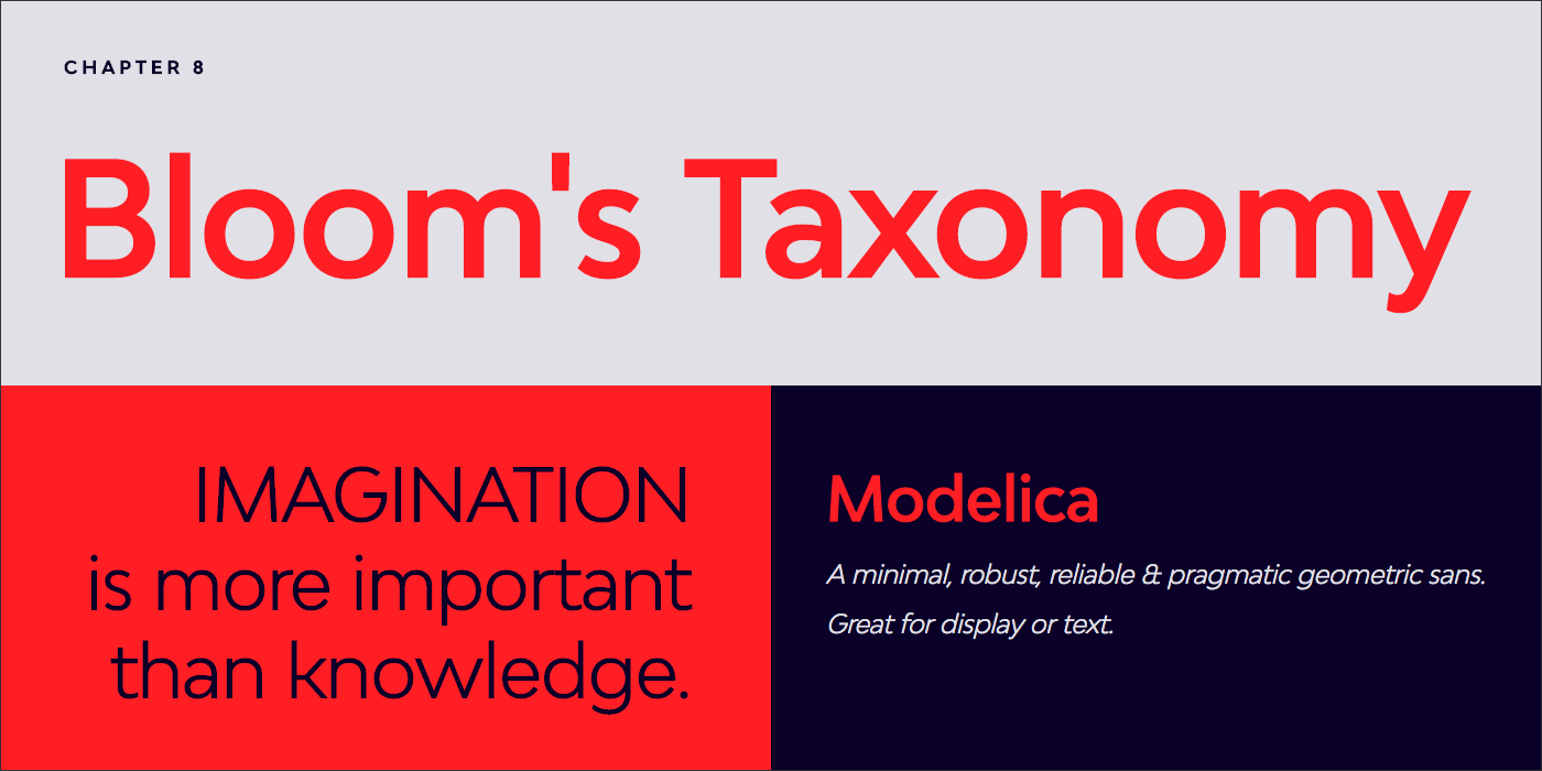
BW Modelica
A great geometric sans. I really love some of the stylistic alternates available—particularly the lowercase a.
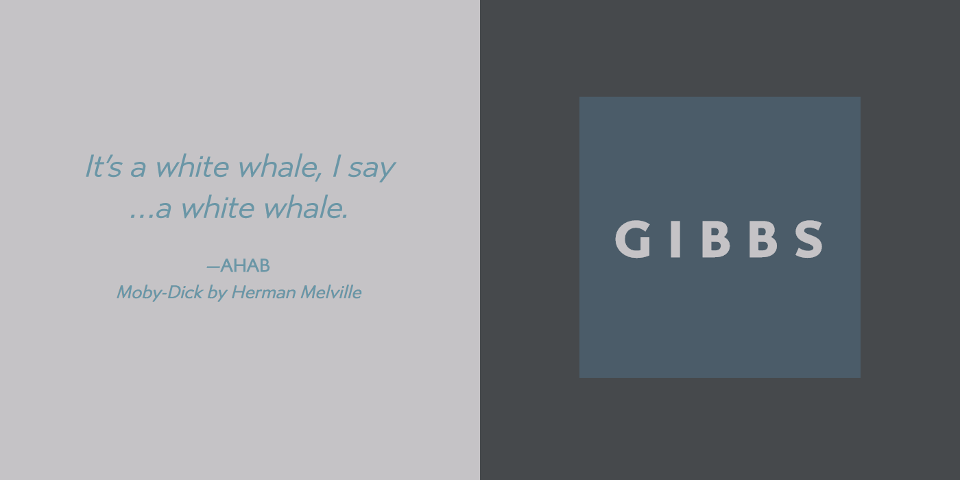
Gibbs
This typeface was inspired by the signage on a luxury ship. You can see a lot of influence from English typefaces like Gill Sans and Johnston. Also check out another great sans-serif typeface from Typetanic Fonts, Transat.
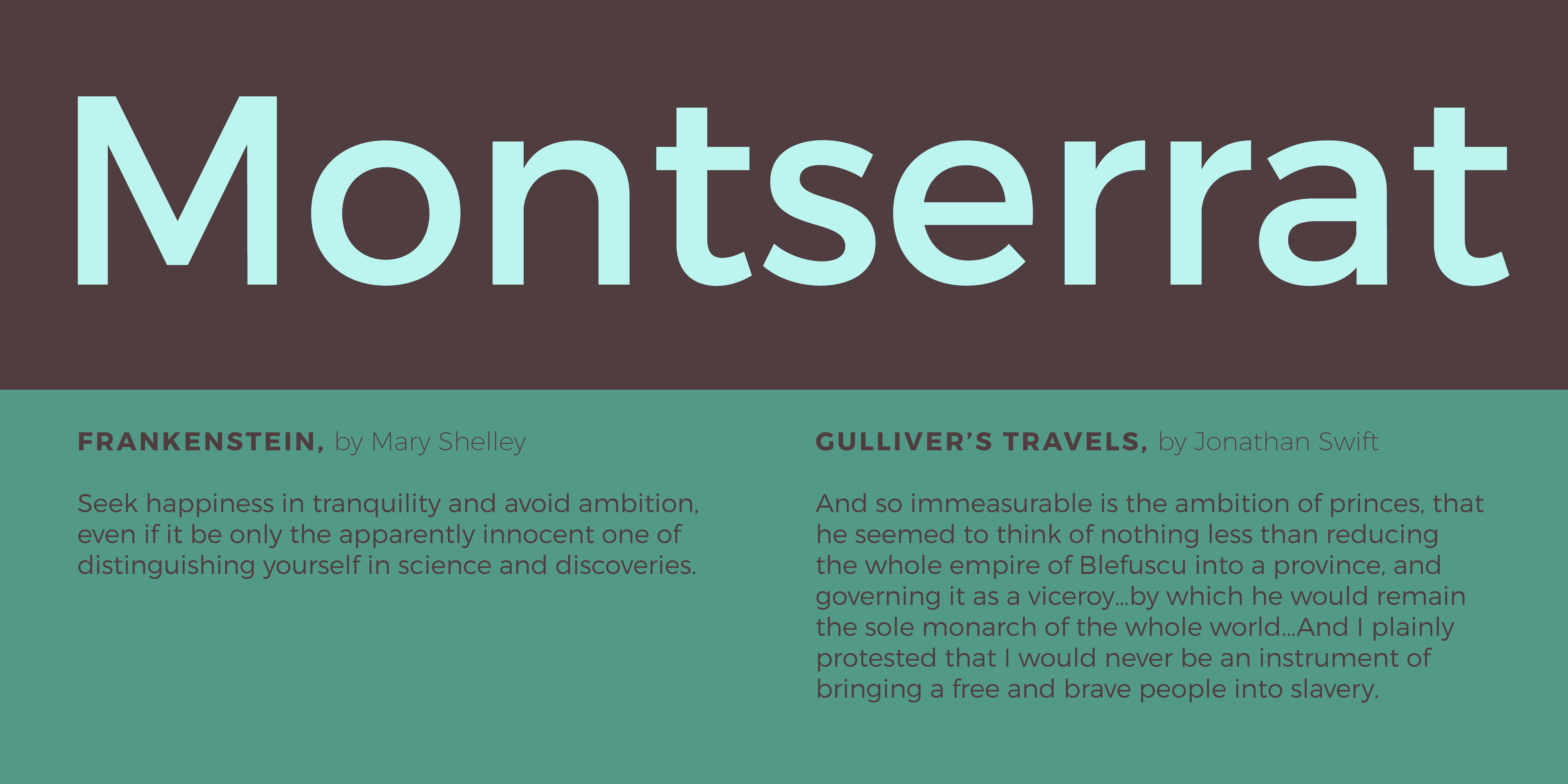
Montserrat
You can’t beat Montserrat if you need a geometric/grotesque that is free. The big drawback of course is that there’s no italic. But don’t let it scare you off: in the right setting (navigation, etc) you may not need italics.
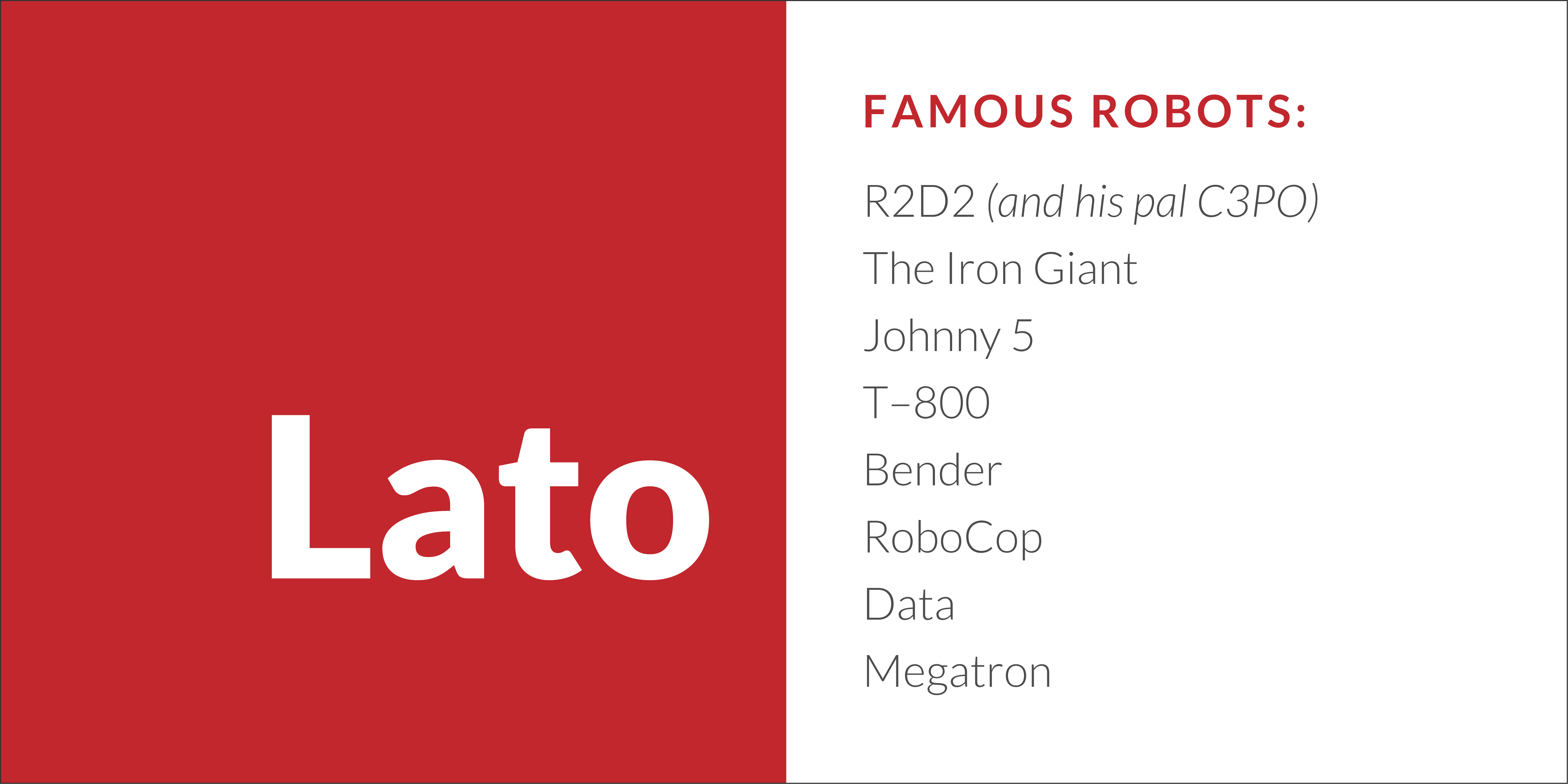
Lato
Another freebie! I like Lato because it’s got a really friendly, humanist feel to it without being super quirky.
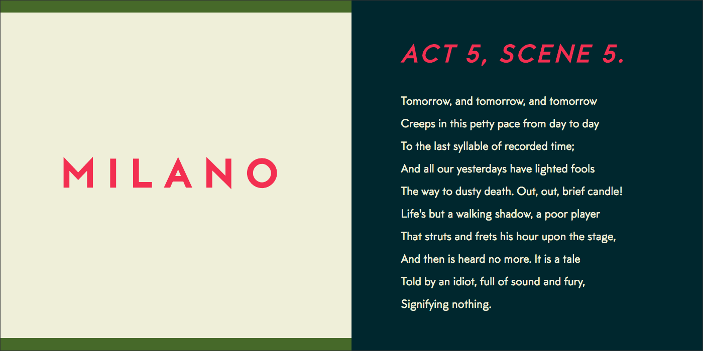
MTT Milano
I like to think of Milano as Futura in heels. But that doesn’t give it enough credit: it’s an exquisite typeface that’s designed with the needs of contemporary designers in mind. Great as a display face, but it can totally work for body copy too.
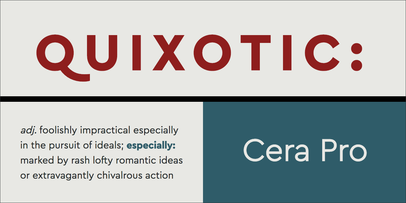
Cera
Cera definitely leans more heavily toward geometric than a lot of the other typefaces listed here, but it doesn’t look stiff like other geometrics sometimes do. And check out Cera Brush and Cera Stencil: they’re great companions to the font family.
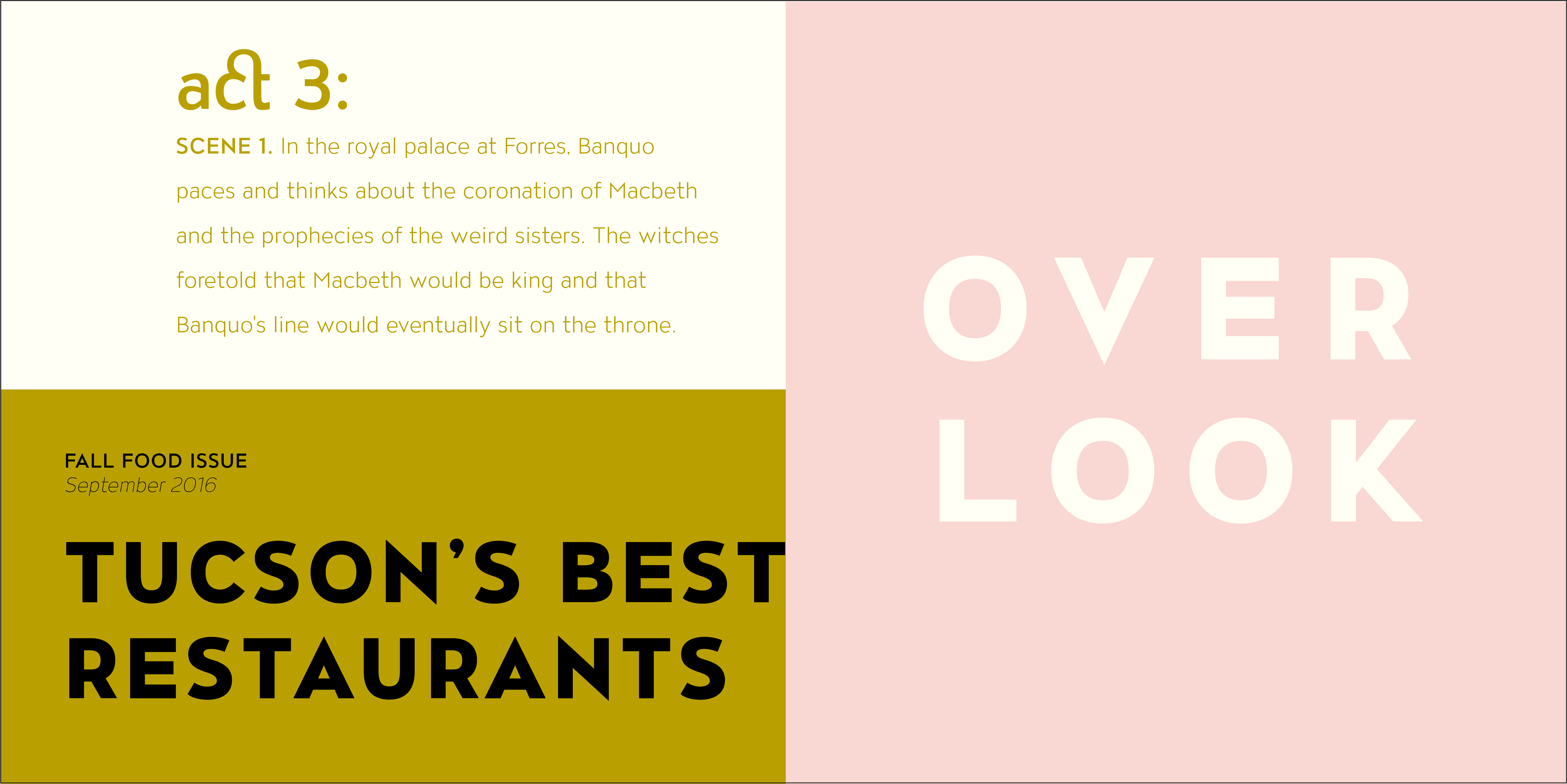
Overlook
When you think of a geometric/grotesque inspired typeface, you probably don’t think elegant, but that’s exactly what Overlook is. This is one of my favorite typefaces of the moment. From Avondale Type Co, a new-ish foundry based out of Chicago.
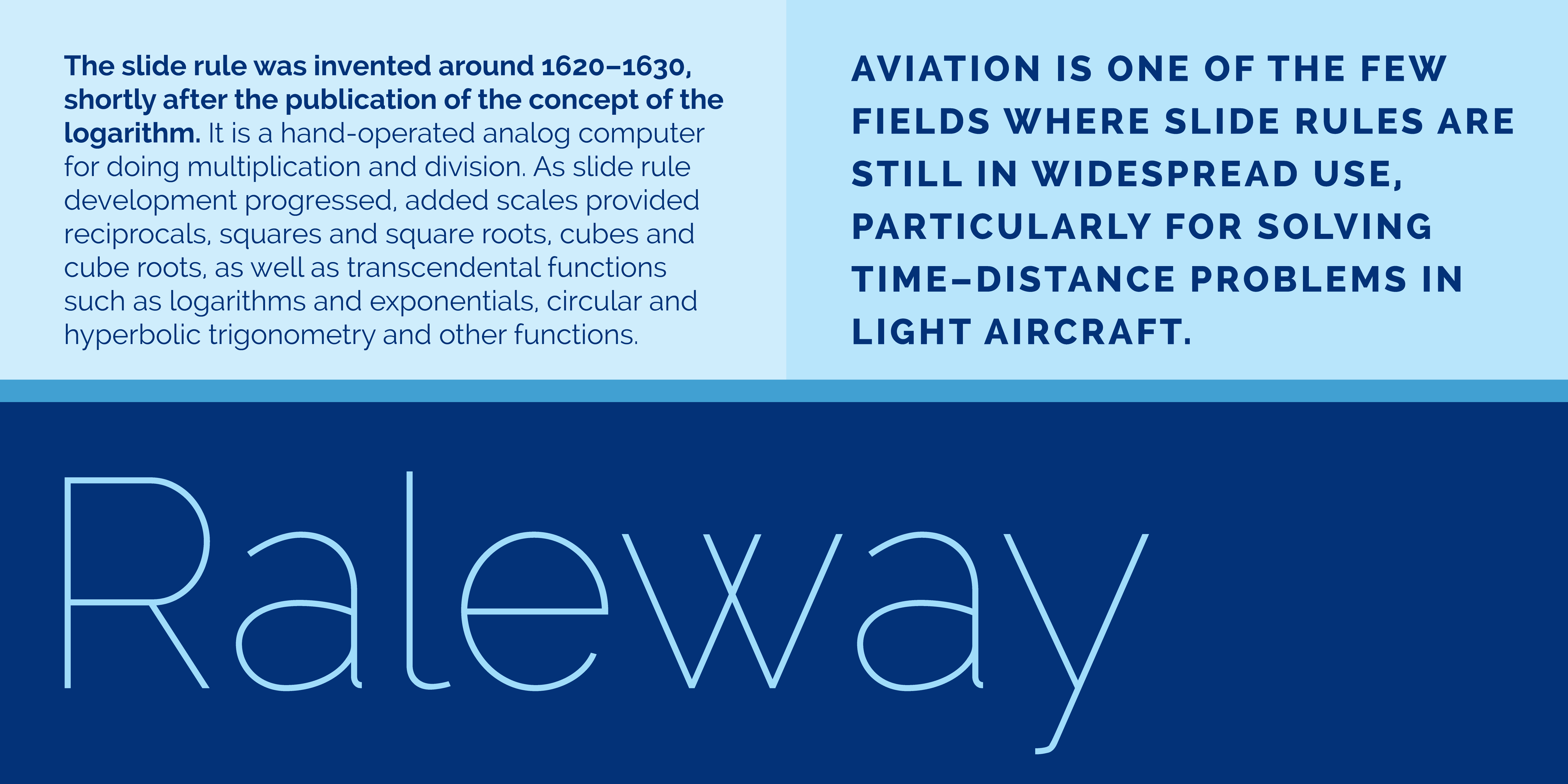
Raleway
Raleway is another good option if you need something free. It’s a complete and well-designed font family, produced by the League of Moveable Type.
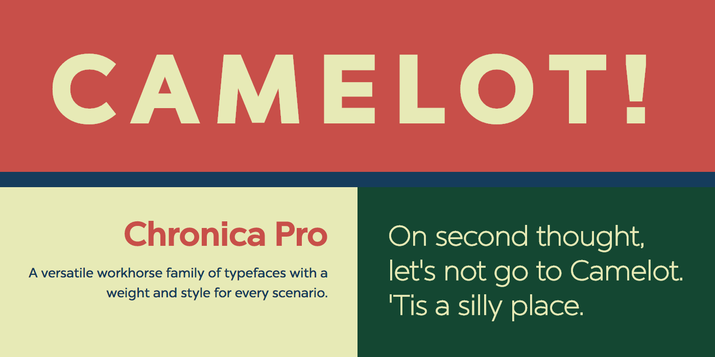
Chronica
Another strongly-geometric typeface that’s humanist enough that it doesn’t appear stiff. Chronica is an extremely complete font family and to be honest you will probably never use every single weight of this typeface. But as Barney Stinson would say, “challenge accepted!”
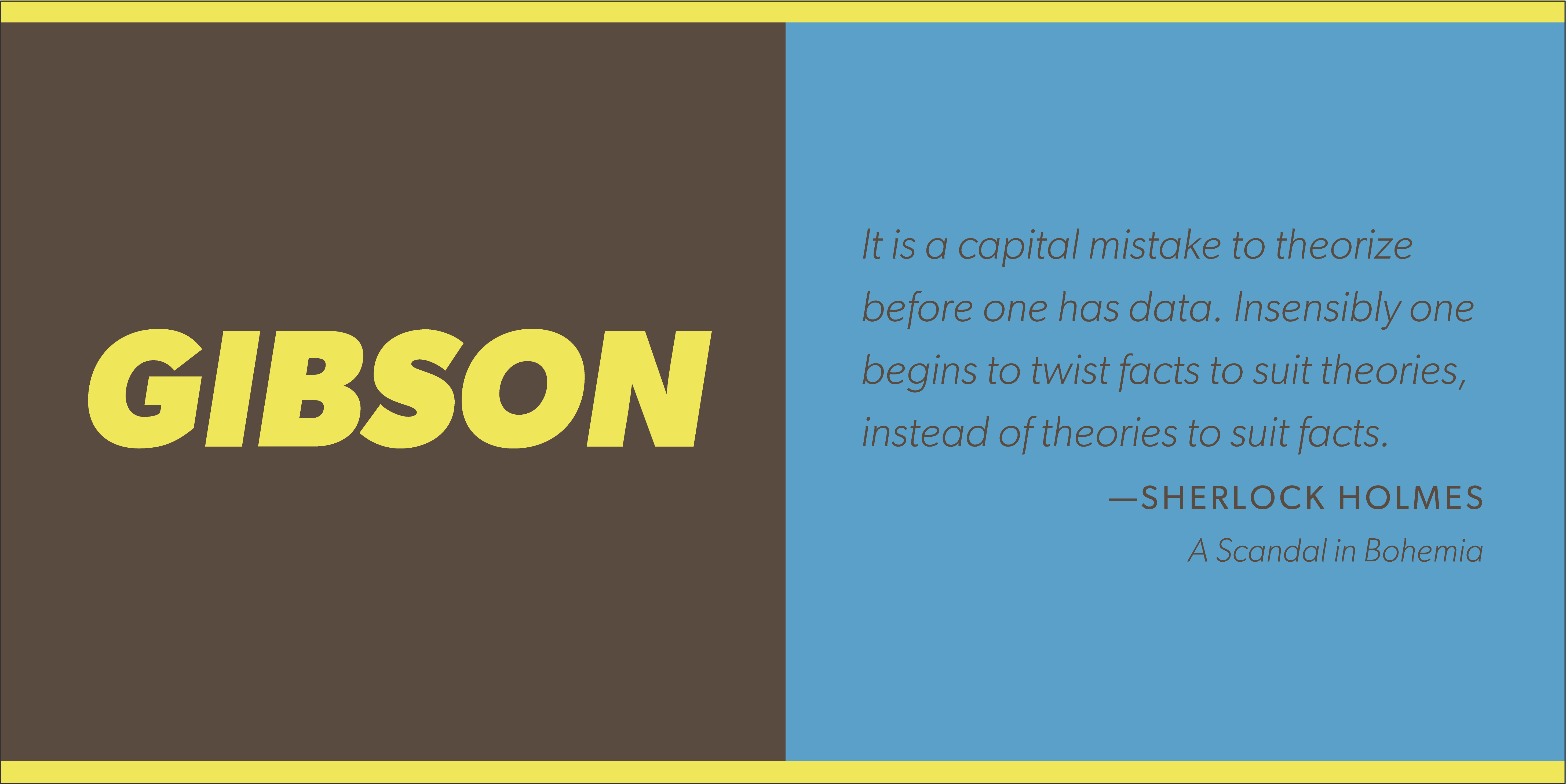
Gibson
Gibson is a versatile, workhorse typeface designed (and priced!) for design students and designers just starting out. The idea was to give designers on a limited budget a high-quality, complete font family suitable for a variety of applications. Thanks Canada!
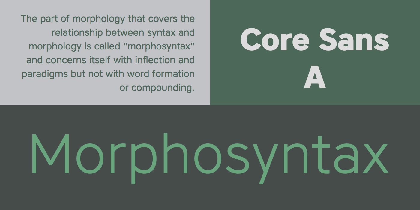
Core Sans
Technically this is Core Sans A, and there’s a whole series of other versions. This typeface looks a whole lot like Proxima Nova, but overall it’s somewhat wider.
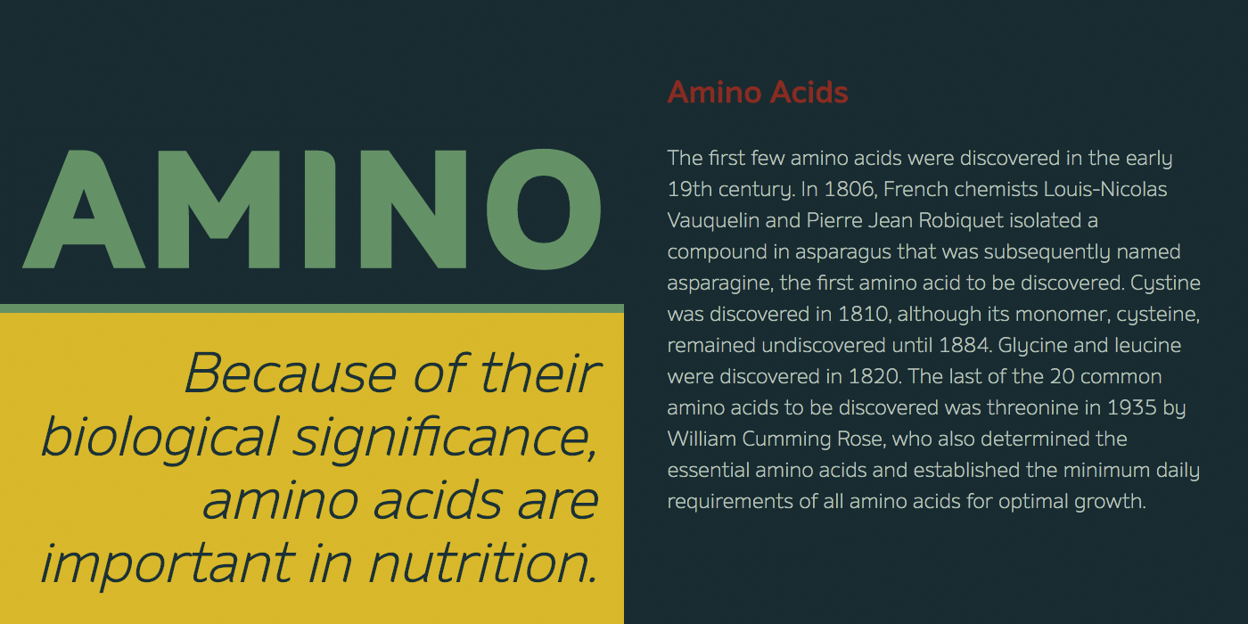
Amino
Amino has a peculiar charm which is more evident in the heavier weights, with the terminals being half rounded and half squared off. The italics feel extremely graceful for a sans-serif face.
If you found this article helpful, you won’t want to miss my handy cheat sheet for combining typefaces! Type your email below to get it delivered to your inbox.